 Addy
Addy  Addly
Addly  Goalify
  Monet
Monet  Reviso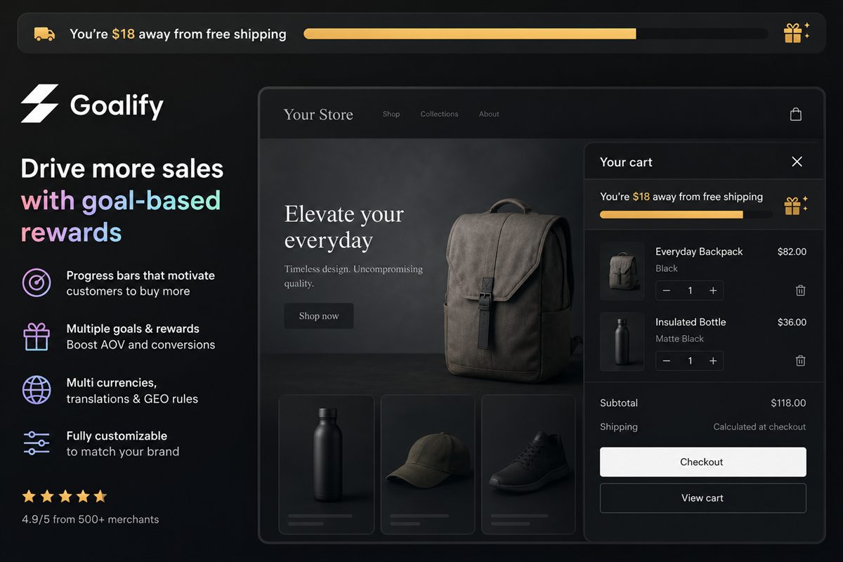
Key takeaways
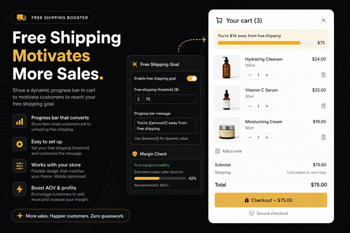
- Show the remaining amount, not the target. "You are $14 away" outperforms "Free shipping over $70" because one is a task and the other is a rule.
- The goal-gradient effect means motivation increases as the bar fills, which is why the visual matters and a text-only statement underperforms.
- Placement order by value - cart drawer, cart page, product page, sticky site bar. Most stores get the most from the first alone.
- The completion state is not a formality. Celebrating the crossing is what makes the next goal in a stacked ladder credible.
A free shipping threshold is a number. A progress bar is what turns that number into behaviour.
The distinction matters because plenty of stores set a sensible threshold, state it in the footer and on a shipping policy page, and then wonder why it did not move average order value. The threshold was never the active ingredient. Visibility was.
Why a bar beats a statement
Three well-documented effects are doing the work.
The goal-gradient effect. Motivation to complete a task increases as perceived distance to completion decreases. A shopper at 80% of a threshold is substantially more motivated than one at 30% — and neither is motivated at all if they cannot see where they stand.
The endowed progress effect. People are more likely to complete a task they have already started. A cart with anything in it has already started; the bar makes that visible.
Loss framing. "You're $14 away from free shipping" implicitly frames not adding as losing something. That is a stronger motivator than gaining the equivalent amount.
None of these operate on a static policy statement, because a policy is information and a bar is feedback.
The copy that works
The pattern is consistent enough to be a rule.
| Copy | Why it works or does not |
|---|---|
| "Free shipping over $70" | Weakest. A rule about you, requiring the shopper to do arithmetic. |
| "Spend $70 for free shipping" | Better, still a target rather than a gap. |
| "You're $14 away from free shipping" | Strong. Second person, specific gap, immediate. |
| "Add $14 more to unlock free shipping" | Strong. Adds a verb and the word "unlock". |
| "Almost there! Free shipping soon" | Weak. No number, so no goal. |
| "🎉 You've unlocked free shipping!" | Correct completion state. Names the achievement. |
Four principles behind those:
- Second person. "You" outperforms passive or store-centric phrasing.
- The gap, not the target. The remaining amount is the number that matters.
- The shopper's currency, converted and rounded properly. A gap expressed in a foreign currency is not a goal.
- A verb. "Add", "unlock", "reach" all outperform a bare statement.
Placement, in order of value
1. The cart drawer
The highest-value position by a wide margin. This is where the shopper evaluates their basket as a whole, and it is the only place where "add one more thing" is a one-click action rather than a navigation.
Put it at the very top, above the line items. Below them it reads as a footnote. Above them it reads as an instruction, and it frames everything beneath.
2. The cart page
Same logic, for stores that use a full cart page or for shoppers who navigate there directly.
3. The product page
Useful, with a caveat. It works well for stores where shoppers commonly add one item and head straight for checkout, because it introduces the goal before the cart even opens.
The caveat: do not show a bar at 0% to a shopper with an empty cart. An empty progress bar communicates distance, not opportunity. Either hide it until the cart has something in it, or show the threshold as a plain statement until there is progress to display.
4. A sticky site-wide bar
Reinforcement rather than a driver. It keeps the offer present while browsing, which has value, but the conversion moment happens in the cart. Treat it as a reminder, not as the main implementation.
The completion state
Most implementations treat crossing the threshold as an end state — the bar fills, the message changes, done.
That is a missed opportunity, for two reasons.
Celebration reinforces credibility. A visible, slightly emphatic completion state teaches the shopper that goals in your store are real and reachable. That matters if you run more than one.
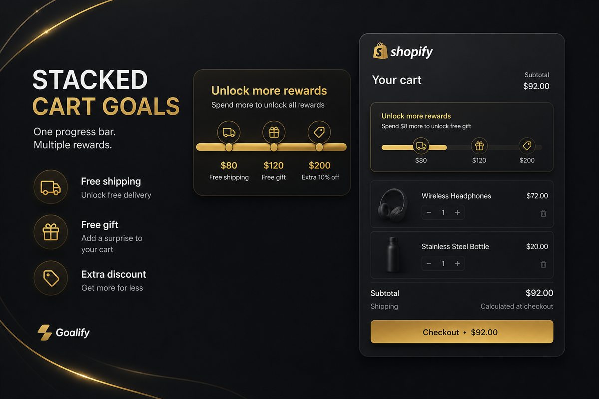
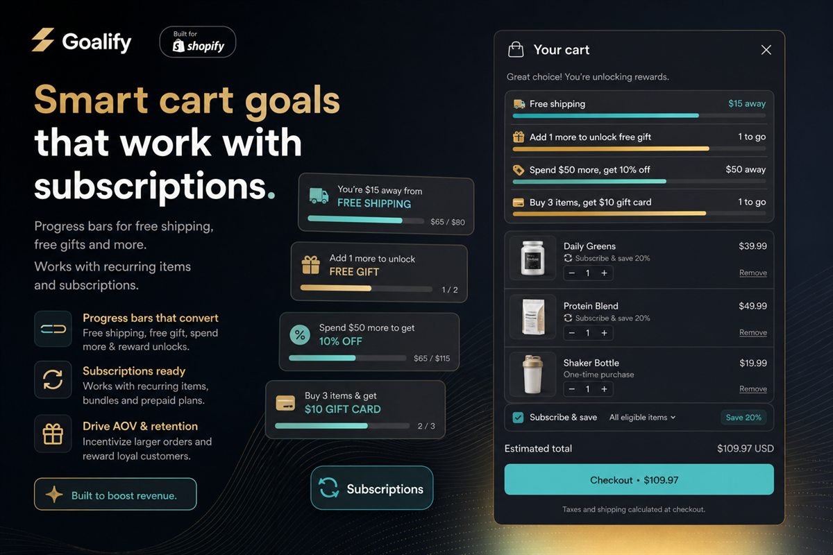
The next goal should appear immediately. A shopper who lands at $73 on a $70 threshold has, at that moment, no further reason to add anything. If a second tier exists — an order discount at $110, a free gift at $150 — it should appear the instant the first is met.
That is the difference between a threshold that captures one behaviour change and a mechanic that keeps working across the whole upper half of your order distribution.
Design details that matter
- Animate the fill, briefly. A bar that jumps instantly is less noticeable than one that visibly moves. Two hundred milliseconds is plenty.
- Announce changes to screen readers. Use
aria-live="polite"on the message so the update is spoken. This is a genuine accessibility requirement, not a nicety. - Respect reduced motion. Users with
prefers-reduced-motionset should get the state change without the animation. - Contrast the fill against the track. A bar that is hard to read at a glance defeats the purpose.
- Keep it one line on mobile. Two-line bar copy on a phone eats vertical space in the cart drawer that line items need.
- Never let it push the checkout button below the fold. The bar supports the primary action; it does not compete with it.
Localisation
The bar is one of the most-read strings on your site, which makes untranslated bar copy unusually damaging.
Three requirements:
- Translated copy for every language you sell in, not just your top two.
- Converted and rounded amounts in the shopper's presentment currency. A gap of "€12.83" reads as a machine output; "€13" reads as a goal.
- Per-market thresholds. The threshold behind the bar should be set from that market's own order distribution and shipping cost, not converted from your domestic number.
What to measure
Not average order value on its own — a threshold raises AOV mechanically.
- Share of orders above the threshold, before and after. The direct behaviour measure.
- Median order value, which is more honest than the mean for this purpose.
- Cart-to-checkout rate. The guardrail. A bar that adds visual clutter without a well-set threshold can cost conversions.
- Distance-at-checkout distribution. Underused and very informative: how far from the threshold were the orders that did not cross it? If most sit just below, your threshold is slightly too high. If most are far below, it is much too high.
That last chart is the fastest diagnostic there is for a threshold that needs adjusting, and almost nobody looks at it.
Frequently asked questions
Does a free shipping progress bar actually increase average order value?
Consistently, when the threshold is set correctly. The bar itself does not create the effect - the threshold does - but the bar is what makes the threshold visible and personal, and a threshold nobody can see their progress against behaves like a policy rather than a goal.
Where should the free shipping bar be placed?
The cart drawer produces the most value because that is where the shopper is evaluating their basket as a whole. The cart page is second, the product page third. A sticky site-wide bar is useful reinforcement but rarely the main driver.
What should the progress bar say?
The remaining amount in the shopper's currency, phrased in the second person. "You are $14 away from free shipping" is the base pattern. Avoid stating the threshold on its own, and avoid vague language like "almost there" without a number.
Should the bar show on the product page too?
It can help, particularly for stores where shoppers add a single item and go straight to checkout. Be careful that it does not appear before anything is in the cart, where a bar at zero percent is discouraging rather than motivating.
What happens after the shopper reaches the goal?
Two things should happen. The bar should visibly celebrate the crossing, which reinforces that goals in your store are real. And if you run stacked goals, the next tier should immediately appear so the mechanic keeps working above the first threshold.