 Addy
Addy  Addly
Addly  Goalify
  Monet
Monet  Reviso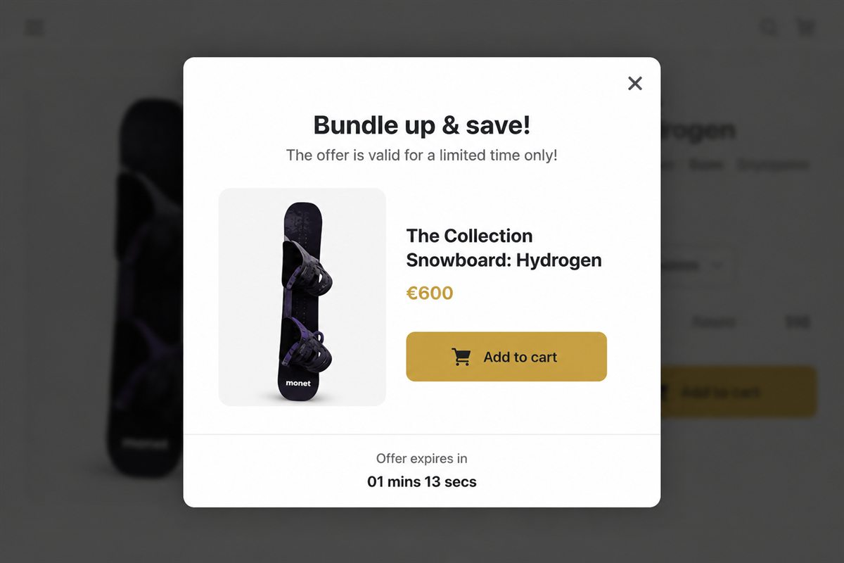
Key takeaways
- Match the theme's type, radius and button colour. A popup that looks like a different website gets closed as an ad.
- One product image, cropped like your PDPs, not a lifestyle collage. The shopper has seconds.
- The add button is the same component as add-to-cart on the product page. Do not invent a new CTA style for the overlay.
- Mobile: full-width sheet from the bottom beats a centred modal that covers the product they just added.
- Keep motion to a short ease-in of roughly 200 to 250ms. Bounce, confetti and delayed buttons make an overlay feel like malware.
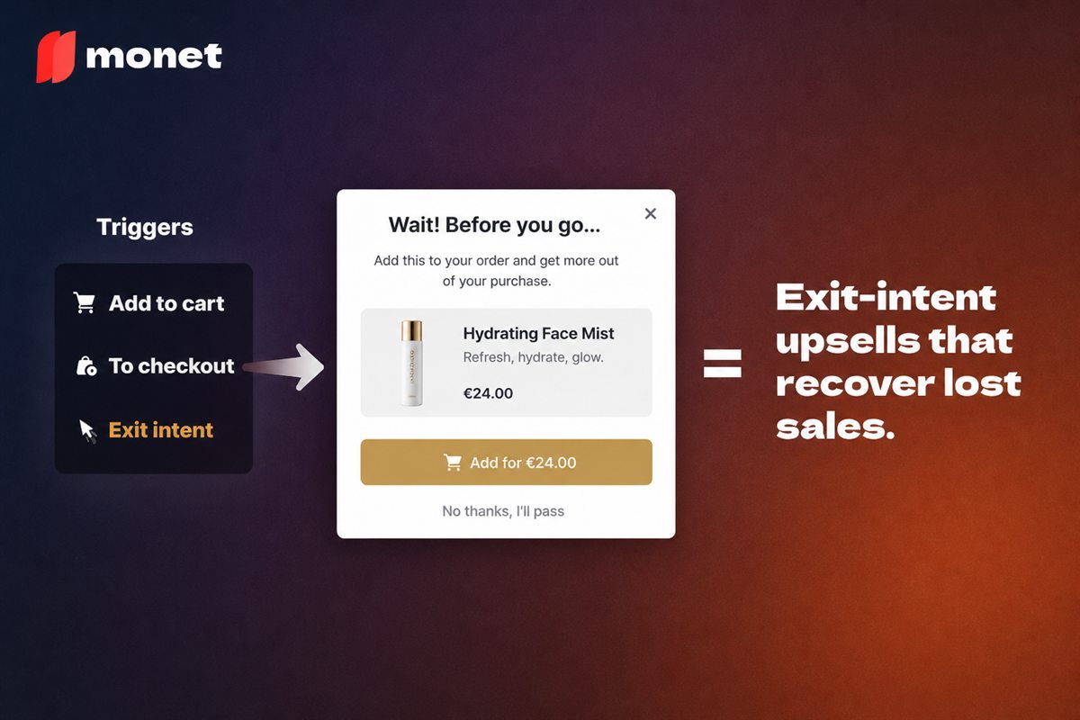
An upsell popup converts when it looks like part of the store rather than something laid on top of it: the theme's typeface, button style and corner radius, one product image cropped like your product pages, a single add button that matches add-to-cart, and a bottom-sheet layout on mobile. Design is not decoration here. It decides whether the shopper classifies the overlay as "part of this purchase" or "an ad".
People do not read popups. They recognise them. If the overlay looks like the rest of the store, it is a question. If it looks like a template from another brand, it is an interruption.
What makes an upsell popup different from other popups
A newsletter popup asks for something. A discount popup gives something. An upsell popup asks the shopper to extend a decision they have just made: "You added the mug; do you also want the beans?" That framing only survives if the popup visibly belongs to the same purchase. The moment it looks like a separate piece of software, the shopper stops thinking about the beans and starts thinking about closing the window.
So the design job is narrow: make the overlay indistinguishable from the store, then get out of the way of the one decision.
Steal the theme, do not restyle it
Same typeface, same button, same radius, same primary colour. The add button in the popup should be indistinguishable from add-to-cart on the product page. That continuity is the conversion feature.
Where to find the values on Shopify: Online Store → Themes → Customize → Theme settings. Most themes expose typography, colour schemes and button corner radius there. Copy those values into your popup app rather than picking "something close". Almost-the-same is the most recognisable tell of a third-party widget. The same principle applies to the cart drawer, and if both surfaces match the theme the whole post-add flow feels like one thing.
Hierarchy: what goes where
Top to bottom, in this order and with nothing else:
- Product image. One, PDP-quality, the correct variant if you can resolve it.
- Name and price. Price in the same format as the rest of the store, including compare-at if the offer is discounted.
- One line of why. "Pairs with the mug in your cart." Not a description.
- Add. The primary button, full width on mobile.
- Dismiss. Text under the button ("No thanks") plus an X in the corner.
If a review stars row, a countdown, three trust badges and a coupon field are in the overlay, you have built a landing page. Landing pages do not belong in a modal. The one-offer rule covers what to put in the popup; this is about how it should look once you have chosen.
How to design the popup on Shopify, step by step
- Screenshot your product page at desktop and at 390px wide. This is the reference.
- Pull four tokens from the theme: body typeface, heading typeface, button radius, primary button colour.
- Set the popup width. Roughly a third of the desktop viewport. Never full-screen.
- Use the product's own image, cropped the same way as the product grid. No lifestyle collage, no stock photo of a happy person.
- Style the add button as an exact copy of your add-to-cart button, including hover and focus states.
- Set the dismiss as a text link under the add button and an X. Two exits, both obvious.
- Choose the dim. A light overlay, enough to focus attention, not enough to hide the page.
- Test on a real phone. Not the browser's device emulator. Thumb reach and the keyboard matter.
Mobile is a sheet
From the bottom, thumb-reach add button, dismiss as text under the button as well as an X. Centred desktop-style modals on a 390px screen cover the cart confirmation and panic people. The bottom sheet leaves a strip of the page visible at the top, which tells the shopper where they are and that their add-to-cart worked.
| Element | Desktop | Mobile |
|---|---|---|
| Position | Centred modal | Bottom sheet |
| Width | About a third of the viewport | Full width |
| Image | Left or top, square crop | Top, square crop, smaller |
| Add button | Theme button size | Full width, within thumb reach |
| Dismiss | X plus text link | X plus full-width text link under Add |
| Dim | Light | Light, page strip visible above sheet |
Motion
200 to 250ms ease. No bounce. No delay on the add button. Delayed CTAs are a dark pattern and they get reported as such. Entrance animation should move the overlay from where it came from (up from the bottom on mobile, a small fade-and-scale on desktop) so the shopper's eye follows it. Exit should be faster than entrance.
Common design mistakes
- A second colour palette. The app's default blue on a store that never uses blue.
- Lifestyle imagery. A collage of the product in use is a marketing asset; the popup needs a catalogue crop.
- Too many exits. "Continue shopping", "View product", "See all" and an X. Each is a leak. Two exits: Add or No thanks.
- Badges. Trust badges and review stars belong on the product page. In a popup they read as trying too hard.
- Countdowns. A timer in an upsell overlay is a dark pattern, and it reads as one.
- Restyling the add button. A pill button in a popup on a store with square buttons looks like an advert for a different store.
How to measure popup design
Design changes should be tested one at a time, holding the offer and the trigger constant, exactly as you would test the SKU. The metrics are the same: attach rate of the offered product, close rate, and checkout initiation after the popup. If a redesign lifts attach but shoppers who dismiss it then leave the site, the design is too aggressive. Also confirm that frequency capping did not change between versions, because a cap difference will swamp any design effect.
The test
Screenshot the popup on a product page. Blur the copy. Could a designer from your team tell it belongs to this store from colour and type alone? If not, stop adding offers and fix the skin. A perfect offer in a foreign-looking overlay will still be closed as an ad.
Frequently asked questions
Should upsell popups be full-screen on mobile?
No. A bottom sheet that leaves a sliver of the page visible is enough. Full-screen feels like a hijack. The shopper just added something; let them still see that they did, and keep the add button within thumb reach.
How much copy should an upsell popup have?
A title, a one-line reason such as "Pairs with the mug in your cart", and a price. If you need a paragraph to explain the product, you picked the wrong product for a popup; choose a lower-consideration attachment instead.
Should the overlay behind the popup be dark?
Use a light dim, not a blackout. The shopper should still recognise the page they were on. Continuity with the page is a large part of why they might say yes, and a heavy overlay breaks it.
Do animations help popup conversion?
A short ease-in of around 200 to 250 milliseconds is fine and helps the eye track where the overlay came from. Bounce effects, confetti and buttons that appear after a delay make overlays feel like malware and get them closed.
What size should an upsell popup be on desktop?
Large enough for one product image, name, price, one line of copy and two buttons, and no larger. A modal that fills the viewport reads as a takeover. Something in the region of a third of the screen width is usually plenty.
Should the popup match my Shopify theme or stand out?
Match the theme. Same typeface, same button style, same corner radius, same primary colour. A popup that stands out is classified as an advert and dismissed. A popup that looks like part of the store is read as a question about the purchase.