 Addy
Addy  Addly
Addly  Goalify
  Monet
Monet  Reviso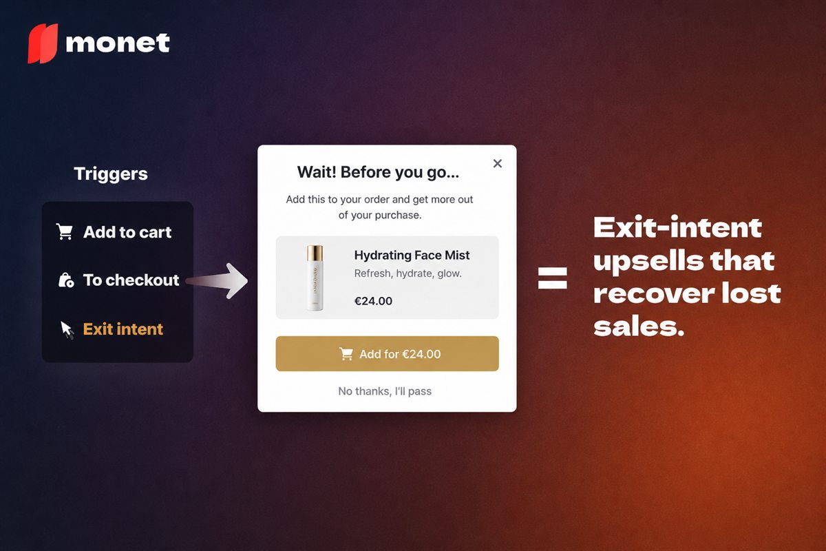
Key takeaways
- Exit intent is the only popup trigger with no conversion downside, because the visitor has already signalled they are leaving.
- Desktop detection uses cursor velocity toward the browser chrome. Mobile has no equivalent, so mobile exit popups rely on back-navigation and scroll signals and are inherently less precise.
- Where the popup fires matters more than what it says. On a cart page it should address the reason for leaving. On a collection page it is just an interruption.
- One offer, one action. Exit popups with two competing choices convert measurably worse than those with one.
Popups have earned their reputation. The five-second timer that covers a page you have just started reading is a genuinely bad piece of interface design and everyone involved knows it.
Exit intent is a different thing, and the difference is structural rather than cosmetic. A timed popup interrupts someone who is still deciding. An exit popup appears in front of someone who has already decided to leave. There is no conversion left to lose.
That single property is why exit intent is worth doing properly while most other popup triggers are worth deleting.
How exit detection actually works
It is worth understanding the mechanism, because the mechanism explains the limits.
Desktop
The browser exposes cursor coordinates continuously. Exit-intent code tracks position over time and looks for a specific pattern: rapid upward movement toward the top edge of the viewport, where the address bar, tab strip, back button and close button all live.
When velocity toward that edge crosses a threshold, the code fires. Typical implementations also require the pointer to actually leave the viewport bounds, which reduces false positives from someone reaching for a bookmark.
It is a heuristic, not a certainty. Someone reaching for their coffee will occasionally trigger it. That is acceptable, because the cost of a false positive is low and the popup is dismissible.
Mobile
There is no cursor, so there is no equivalent signal. Mobile implementations fall back on:
- Back-navigation intent — intercepting the history back gesture. The strongest available mobile signal.
- Rapid upward scroll — weak, because it also describes someone scanning a page.
- Inactivity — weakest. Someone who stopped scrolling might be reading.
The honest position: mobile exit intent is a much blunter instrument. Back-navigation is usable; the other two produce enough false positives that they stop being exit intent and become interruptions with extra steps.
Placement decides the offer
The most common mistake is running one exit popup site-wide. The visitor's location tells you why they are leaving, and the offer should answer that reason.
| Page | Likely reason for leaving | Offer that fits |
|---|---|---|
| Cart | Shipping cost, total, delivery uncertainty | Free shipping threshold reminder, delivery estimate, small discount |
| Checkout start | Price, payment friction, second thoughts | Reassurance, payment options, support access |
| Product page | Not convinced, comparison shopping | Related product, size guide, reviews, bundle |
| Collection page | Browsing, no intent yet | Usually nothing. Do not fire here |
| Blog or content | Reading, not shopping | Content offer at most |
The last two rows matter. A visitor leaving a collection page after twenty seconds is not abandoning a purchase — they are browsing. Firing a discount at them costs margin and gains nothing, and it is the behaviour that gave popups their reputation.
Offers ranked by what they cost you
Discounts are the default and the most expensive option. Try the cheaper ones first.
1. The threshold reminder (free)
"You're $12 from free shipping." If the visitor is leaving a cart that is close to a threshold, telling them so is often enough. Costs nothing and addresses one of the most common abandonment reasons directly.
2. The delivery reassurance (free)
"Order today, arrives Tuesday 26 August." Answers the question they may have been leaving to go and find.
3. The cart save (free)
"Save your cart — we'll email you a link." Converts an abandonment into a re-engagement opportunity, and captures an email address as a side effect rather than as the ask.
4. The related recommendation (free)
Particularly effective on product pages. The visitor may be leaving because this specific item is not right, not because your store is wrong.
5. The bundle offer (costs the bundle discount)
"Add the matching item and save 15%." Gives a reason to stay that is about value rather than about price.
6. The discount (costs the discount)
Effective, and the one to use last. Reserve it for high-value carts or first-time visitors where the lifetime value case is strong.
Design rules
Exit popups have a short attention window. Every element must earn its place.
- One offer, one action. Two competing choices measurably reduce conversion. The secondary action should be "no thanks", not a second offer.
- A visible, generously sized close control. A tiny grey X in a corner is a dark pattern and it will end up in a review.
- No second popup. If they dismiss it, they leave. Accept that.
- Frequency capping. Once per session, and no more than once per visitor per week.
- Suppress for converters. A customer who has purchased in this session should never see an exit offer.
- Keep it fast. The popup must render immediately. A slow popup fires after the visitor has already gone.
- Make it accessible. Focus trap while open,
Escapecloses it, focus returns to where it was. This is not optional.
The legal side
Exit popups intersect with a few rules that are worth knowing before you launch.
- Email capture requires consent handling. If you collect an address, GDPR applies: clear purpose, no pre-ticked boxes, and a real unsubscribe.
- Discount terms must be honest. A code that expires in ten minutes must actually expire in ten minutes. A countdown that resets on refresh is a false statement about your commercial terms.
- Accessibility is a legal requirement in a growing number of jurisdictions. A modal that cannot be dismissed with a keyboard is an accessibility failure with legal exposure attached.
Measuring properly
Exit popups have a measurement trap: the denominator is not your traffic, it is your exiting traffic. Judging them against site-wide conversion makes them look worse than they are.
Track:
- Fire rate — popups shown ÷ sessions. Unusually high suggests false positives.
- Engagement rate — interactions ÷ shown.
- Recovery rate — sessions that converted after seeing the popup ÷ sessions shown. The headline number.
- Discount cost per recovered order, if you are offering one.
- Repeat trigger rate — the share of visitors seeing it more than once. Rising means habituation is starting.
- Return visit rate for shoppers who saw and dismissed it. The brand-damage guardrail. If people who see your exit popup come back less often than those who do not, the popup is costing more than it earns.
That last metric is the one nobody measures and the one that decides whether the tactic is sustainable.
A sensible starting configuration
- Cart page and checkout-start only. Nothing on collection or blog pages.
- Desktop cursor-velocity trigger; mobile back-navigation only.
- First offer: a free shipping gap reminder or a delivery estimate — no discount.
- Frequency cap: once per session, once per week per visitor.
- Suppressed entirely for anyone who has already purchased in the session.
Run that for a month. Only add a discount tier if the free offers are not recovering enough, and only for carts above a value where the discount is clearly worth paying.
Frequently asked questions
How does exit-intent detection work?
On desktop it tracks cursor position and velocity, firing when the pointer moves rapidly toward the top edge of the viewport where the address bar and tab controls sit. On mobile there is no cursor, so implementations fall back on back-button navigation, rapid upward scrolling or a period of inactivity, all of which are weaker signals.
Do exit-intent popups hurt conversion rate?
They are the one popup type that structurally cannot, because they only fire on visitors who have already signalled departure. The risk is not conversion loss but brand damage from a poorly targeted or aggressive popup, and from firing repeatedly at the same visitor.
What offer works best in an exit popup?
It depends on where the visitor is. On a cart page, address the likely reason for leaving - shipping cost, delivery uncertainty or price. On a product page, a related recommendation or a reminder often outperforms a discount. A discount is the most expensive option and should not be the default.
Should exit popups offer a discount every time?
No. Habitual discounting at exit teaches returning visitors to trigger the popup deliberately, which converts a retention tactic into a permanent margin reduction. Reserve discounts for high-value carts or first-time visitors, and use non-discount offers elsewhere.
Do exit-intent popups work on mobile?
Less reliably, because the signals are weaker. Back-navigation intent is the most usable trigger. Scroll-based and inactivity-based triggers produce more false positives, which means interrupting people who were not leaving - exactly the failure mode exit intent is supposed to avoid.