 Addy
Addy  Addly
Addly  Goalify
  Monet
Monet  Reviso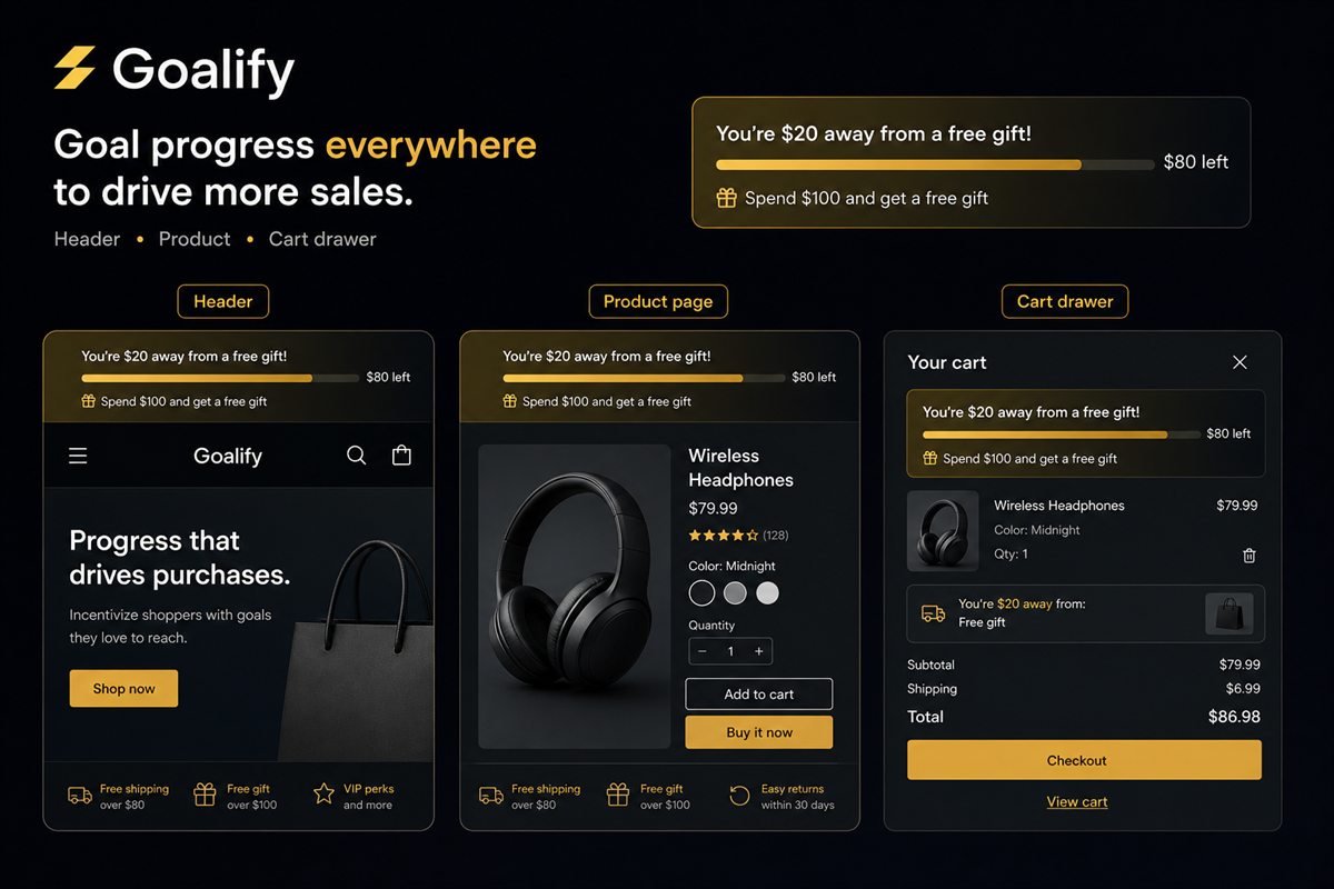
Key takeaways
- The cart is the primary surface. If the bar is not visible when the basket is open, nothing else you do with it matters.
- A product-page bar is a preview, not a second cart. It should use the same remaining amount as the cart, including the item they are looking at if you can do that honestly.
- A site-wide header bar is optional. It helps when the threshold is a brand promise; it nags when it follows the shopper into blog posts and the account page.
- Never run two different numbers in two places. Desync is worse than no bar.
- If you only have time for one placement, put the bar at the top of the cart.
Put a Shopify free shipping progress bar in the cart first — top of the drawer or top of /cart. That is the moment the remaining amount is real and the shopper is deciding whether to add one more item. Add a product-page preview only if it shares the same number. A bar the shopper cannot see at that moment is a settings page, not a conversion feature.
Start in the cart. Add other surfaces only if they share the same remaining amount.
What a free shipping progress bar is
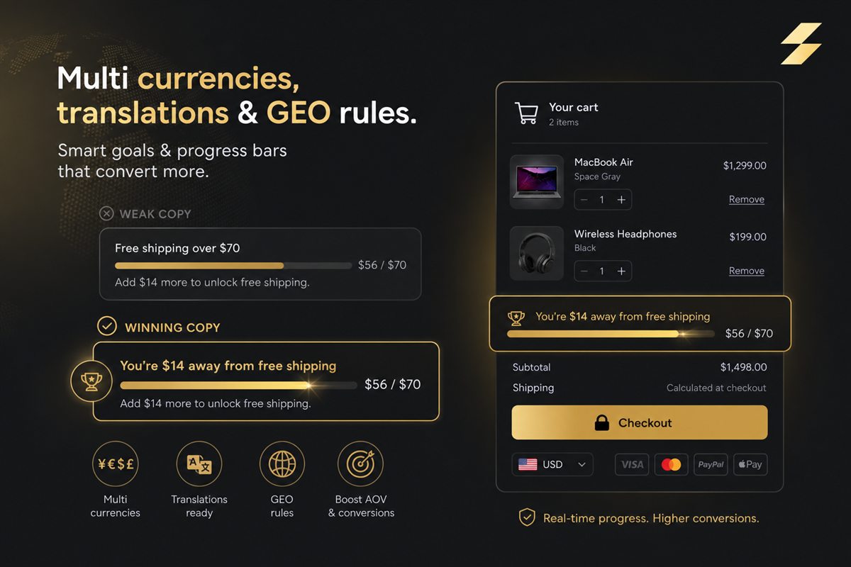
A progress bar is a live remaining-amount line toward a threshold you actually honour: free shipping, a gift, or another cart goal. It is not a static header slogan. The free shipping progress bar guide covers copy and threshold maths. This post is where the bar sits.
If you only have time for one placement, this is it: visible when the basket is open.
The cart comes first
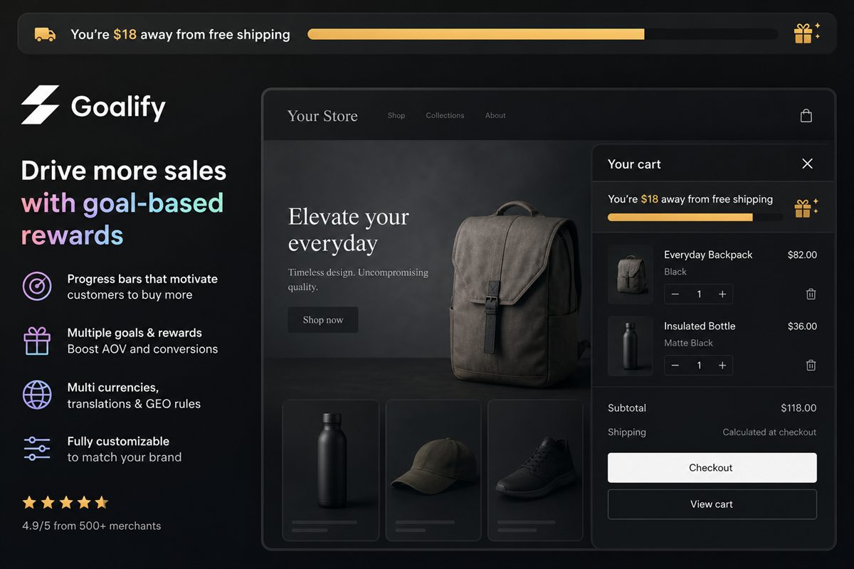
In a drawer, the bar goes at the very top, above line items. In a cart page, the same: full width, first. This is the moment of highest intent and the moment the remaining amount is real.
Do not hide it under an upsell or inside a shipping accordion. The bar is the reason they might add another item. The line items are what they already chose.
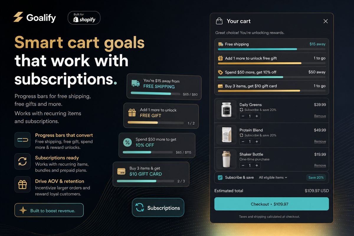
If you use a drawer and a cart page, both must use the same calculator. Stacked cart goals make this harder — one goal, one number.
Product page as a preview
A slim bar on the product page is useful when it answers "if I add this, do I get free shipping?" That requires either:
- Showing remaining without the current item, clearly labelled, or
- Showing remaining with the current item, clearly labelled as a preview.
An unlabelled number that assumes they have added something they have not is how you get angry emails and a support macro.
Good: "If you add this, you'll be $8 away." Bad: a silent $8 that ignores the fact the tee is not in the cart yet.
Collection pages can carry a slim bar if you must. They should still use the same remaining amount, without pretending a product on the grid is already in the basket.
Header bars
A header announcement works for a campaign ("Free shipping over $50 this weekend") and poorly as a forever element. Permanent header bars become wallpaper. Wallpaper does not move AOV.
If you use one:
- Show it on collection and product during a promotion
- Hide it on cart and checkout so you do not show the same message twice
- Hide it on blog posts, policy pages and account pages, where it has nothing to do
Sticky chrome that follows the shopper into "About us" is nagging. Shoppers learn to ignore chrome.
Bar copy still has to name a real remaining amount. A header that says "free shipping" while the cart says $12 away is a desync.
How to choose placement
| Surface | Role | Show when |
|---|---|---|
| Cart drawer / cart page | Primary | Always, if you have a threshold |
| Product page | Preview | If you can label whether the current item is included |
| Collection | Optional preview | Campaigns; same calculator |
| Header | Campaign chrome | Short promotions; hide on cart, checkout, content |
| Blog / policies / checkout | Never | Not a buying moment, or not your page |
Worked example: threshold is $50, cart is $41. Drawer says "$9 away." Product page for an $12 item says "If you add this, you unlock free shipping." Header is off except during the weekend campaign. Three views, one number.
The desync problem
Two bars with two remaining amounts — because one includes discounts and one does not, or one is cached — will be noticed. Shoppers compare. When they do not match, they believe neither, and they will not add the extra item.
One calculator. Many views. That is the whole architecture.
Include the same discounts, gift cards and market-specific rates everywhere. If Markets change the threshold, the bar on that market's cart must change with it.
When not to show a bar
Skip extra surfaces when you cannot keep the number honest, when the threshold is so high that remaining amount is noise, or when you should not be offering free shipping at all. Never run the bar on checkout — Shopify owns that page.
If the cart bar is missing, nothing else you do with placement matters. Fix that slot first.
Then measure items per order and the share of carts that cross the threshold, not clicks on the bar. A header that nobody can ignore is not a win if remaining amount in the cart is still wrong. One calculator, cart first, other surfaces only when they tell the same story.
Frequently asked questions
Should the bar be on every page?
No. Cart, product, collection if you must. Not the blog, not the policy pages, not checkout (Shopify owns checkout).
Can the product-page bar include the current item before it is added?
Only if you make that obvious ("If you add this, you'll be $8 away"). A silent hypothetical remaining amount is a lie when they have not added it yet.
Sticky header bars — good or bad?
Good on collection and product during a shipping promotion. Bad as a permanent chrome element. Shoppers learn to ignore chrome.
What if I use a cart page, not a drawer?
Put the bar at the top of the cart page, full width, before line items. The same remaining-amount copy applies.
Why do two bars show two different remaining amounts?
Usually one includes discounts and the other does not, or one is cached. Shoppers compare. When the numbers do not match, they believe neither and they will not add the extra item. Use one calculator and many views.
Does the bar belong on checkout?
No. Shopify hosts checkout. A second bar there is either impossible or a script you should not add. Get the remaining amount right in the cart before they click checkout.