 Addy
Addy  Addly
Addly  Goalify
  Monet
Monet  Reviso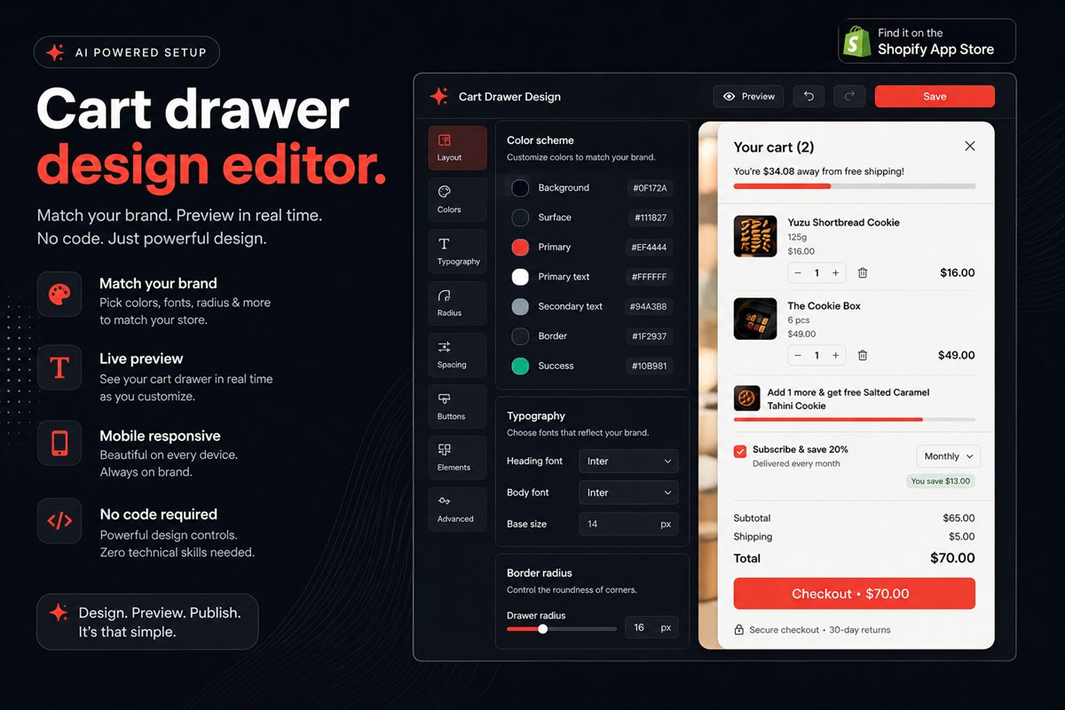
Key takeaways
- A cart drawer that does not match the theme reads as an app, and shoppers discount apps. Match background, type, radius and button colour first.
- Pull tokens from the theme, do not invent a second palette. If the store is warm and rounded, the drawer cannot be cold and sharp.
- The checkout button should be the loudest element in the drawer. Everything else is supporting cast.
- Custom CSS is a last resort. If you need more than a dozen lines, the design tokens are wrong.
- Match the overlay to the storefront. A heavy dim or blur that kills the product page undoes the continuity of a drawer.
A Shopify cart drawer converts when it looks like a continuation of the theme, not like software. Shoppers have a well-trained eye for third-party widgets: the slightly wrong radius, the font that is almost Inter but not the one the rest of the site uses, the checkout button in a blue the brand never uses. If the drawer does not match, the shopper treats it as a detour.
You do not need a developer to fix that. You need the same four tokens the theme already uses, applied in the drawer settings.
What a branded cart drawer is
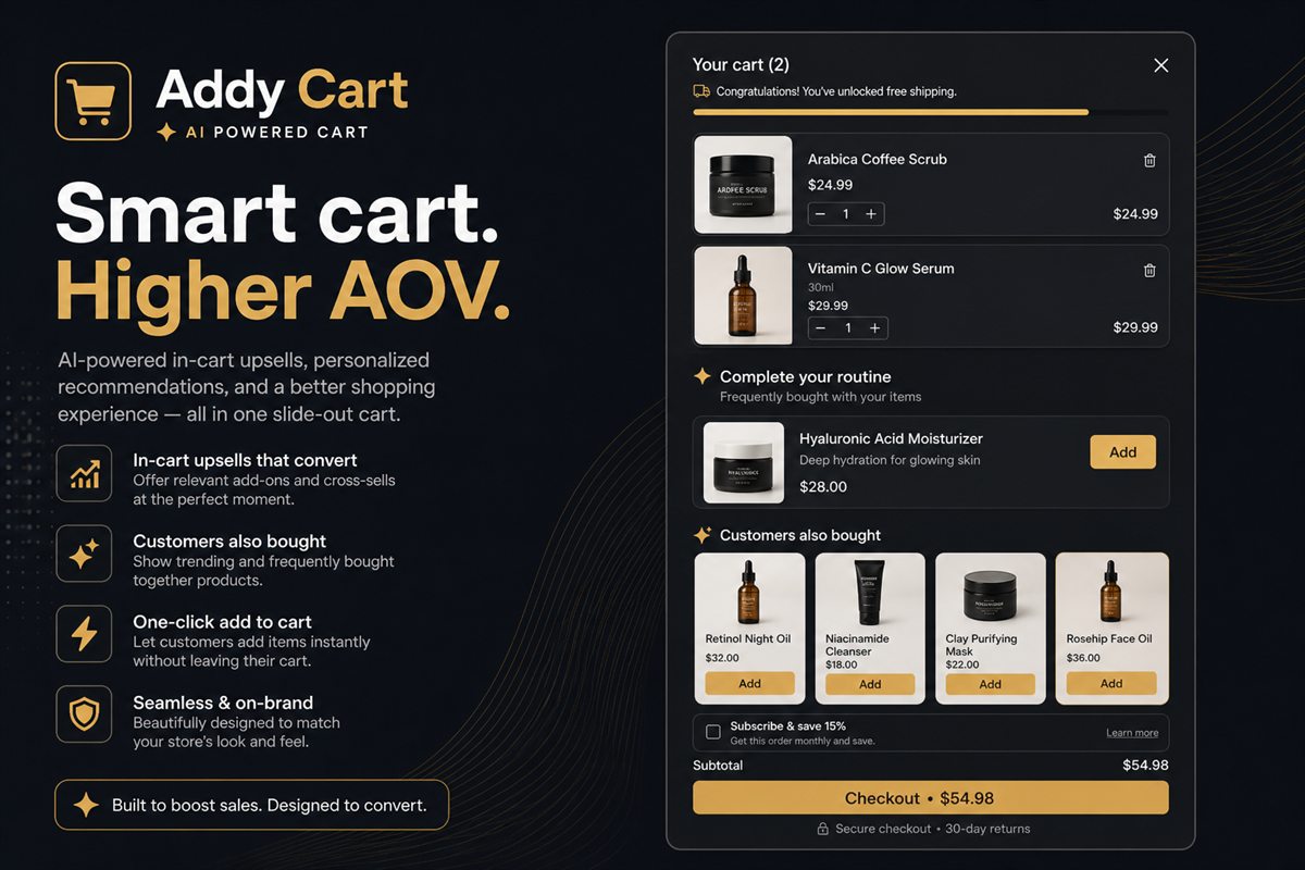
A branded drawer is not a redesigned cart. It is the store's visual language — background, type, radius, primary button — reused on the slide-out that opens after add-to-cart. The full cart drawer can still hold upsells, a progress bar and delivery copy. Those extras only work if the surface itself does not announce "an app just opened."
The test is simple. Screenshot the open drawer. If it could pass as a native theme section, you are done. If a designer can spot the app in under two seconds, keep matching tokens.
Four tokens, in order
Match these before you touch anything else:
- Background. Same as the page, or one step sunken. Not a new colour.
- Typeface and size. The heading in the drawer should be the same family and roughly the same scale as a section heading on the product page.
- Radius. If your buttons are pills, the drawer corners and the checkout button are pills. If your theme is 4px, do not ship 16px.
- Primary button colour. The checkout button is the brand's primary CTA, not the app's default.
Get those four right and the drawer disappears into the store. Get them wrong and no amount of upsell logic will make it feel native.
Pull the values from the theme, do not invent a second palette. In Online Store → Themes → Customize, note the background, heading font, button radius and primary button colour. Paste the same values into the cart app's design settings. If the store is warm and rounded, the drawer cannot be cold and sharp.
How to brand the drawer on Shopify without a developer
- Open the theme editor and write down the four tokens above. Hex codes, font names, pixel radii.
- Open the cart app's theme app embed or app block settings. Map background, heading, body, radius and primary button to those tokens.
- Set the overlay to a light dim. Do not use a branded colour wash.
- Preview a product page, add to cart, and compare the drawer beside the product page at desktop and at 390px width.
- Repeat for a second template if you use a different product template for a market or a bundle SKU.
You should not need to edit theme.liquid. Colours, fonts and radii belong in app settings mapped to existing tokens. A Liquid edit to change a button colour is a sign the app is the wrong tool.
The checkout button is the design
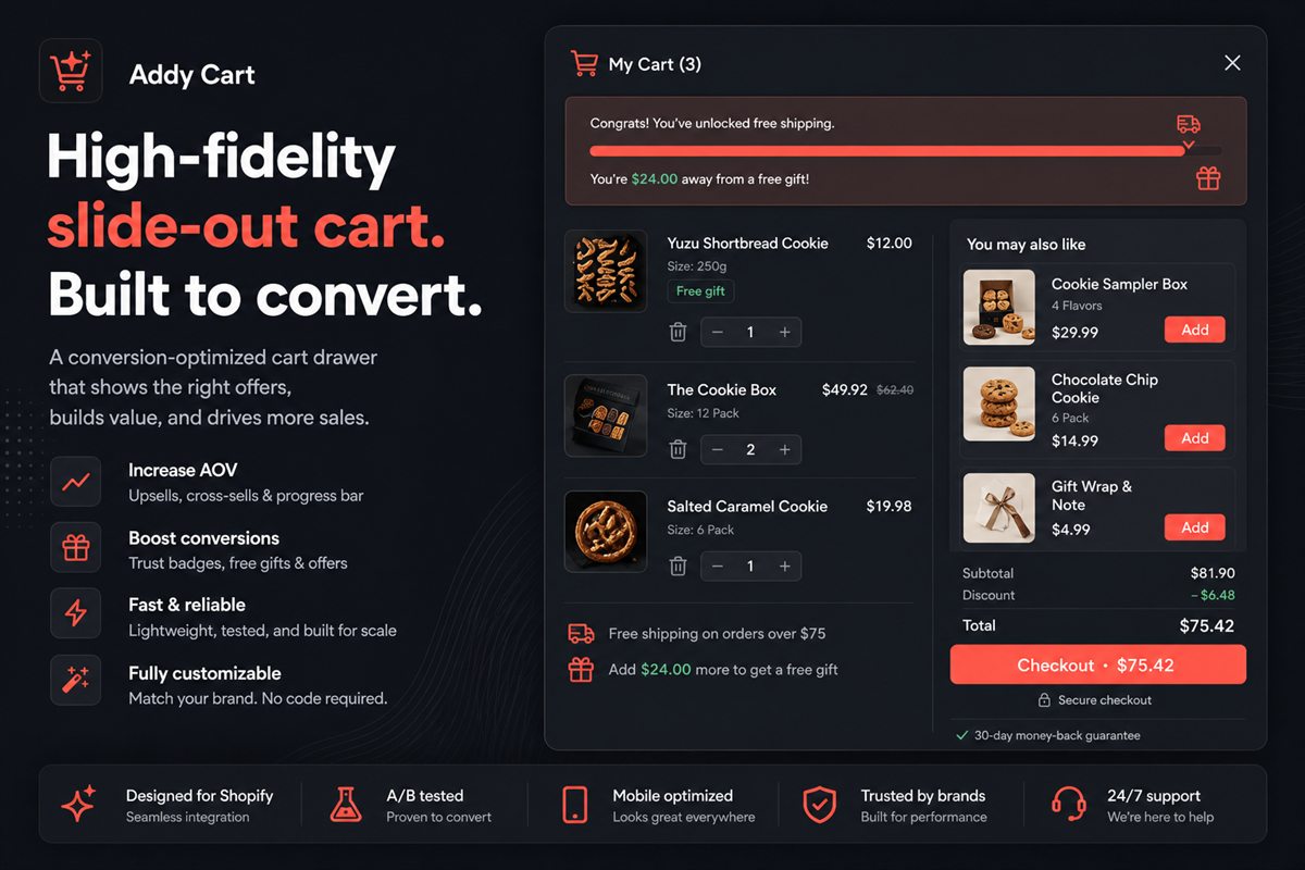
Everything in the drawer exists to support one action. Progress bars, upsells and trust badges are useful; they are not the hero. If the checkout button does not win the visual hierarchy, you have decorated a form.
A useful check: screenshot the open drawer and blur it. You should still be able to point to the checkout button. If you cannot, increase contrast, size or isolation — not the number of badges around it.
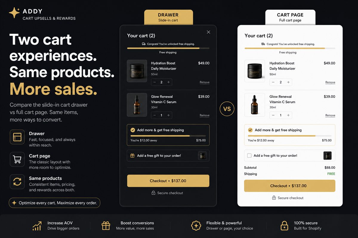
Keep secondary actions quiet. "View full cart" should look like a text link, not a second primary. That hybrid pattern is covered in cart drawer vs cart page. Two loud buttons is how shoppers stall.
What not to customise
Do not add a second logo in the drawer header. Do not add a decorative illustration. Do not change the overlay into a branded colour wash. These are the tells that someone "designed the app" instead of continuing the store.
Custom CSS is for the last stretch: a one-pixel border, a font-feature setting, a focus ring. If you are writing a stylesheet, the settings model failed. If you need more than a dozen lines, the design tokens are wrong.
Also skip:
- A different heading case (all-caps in the drawer, sentence case on the site)
- A new shadow language (heavy drop shadows on a flat theme)
- App-default spacing that is tighter or looser than the product form
Spacing is a token too. If the theme uses generous padding in the buy box, the drawer should not feel cramped.
Markets and multiple carts
If you run Shopify Markets, the drawer has to survive more than one theme accent. The durable approach is to inherit tokens per market rather than hard-coding a single brand colour. A US storefront on a warm palette and a JP storefront on a cooler one should not share a hex code just because they share an app.
Check the drawer on each published theme, not only the primary one. A "good enough" match on the main market is still a widget on the second.
How to check the match before you ship
Open a product page, add an item, and walk this list:
- Background matches the page or sits one step sunken
- Heading and body use the store font
- Corner radius matches buttons
- Checkout button uses the brand primary
- Overlay is quiet; the product behind is still visible
- No second logo, illustration, or extra webfont
Then check drawer performance. A perfectly branded drawer that ships a large bundle on every product page still costs you Largest Contentful Paint. Brand and speed are the same install, not two projects.
Frequently asked questions
Do I need to edit theme.liquid to brand the cart?
Not with a theme app extension. Colours, fonts and radii should be settings in the app, mapped to your theme's existing tokens. If an app requires a Liquid edit to change a button colour, it is the wrong app.
Should the drawer be light or dark?
Match the storefront. A dark drawer on a light store looks like a takeover, not a continuation. The one exception is a store that already uses a dark header or a dark product page.
How close does the match need to be?
Close enough that a screenshot of the open drawer could be mistaken for a native theme section. If a designer on your team can spot the app in under two seconds, shoppers can too.
What about the overlay behind the drawer?
Keep it quiet. A heavy dim or a blur that kills the product page behind it undoes the continuity that made you choose a drawer in the first place. The product should still be recognisable.
Can I match fonts if my theme uses a paid typeface?
Yes, if the app can inherit the theme's font stack rather than shipping Inter as a default. Load the same family the storefront already uses. Do not add a second webfont just for the drawer — that is a performance cost and a visual tell.
What if I run Shopify Markets with different theme accents?
Inherit tokens per market rather than hard-coding one hex. A US storefront on a warm palette and a JP storefront on a cooler one should not share a brand colour just because they share an app.