 Addy
Addy  Addly
Addly  Goalify
  Monet
Monet  Reviso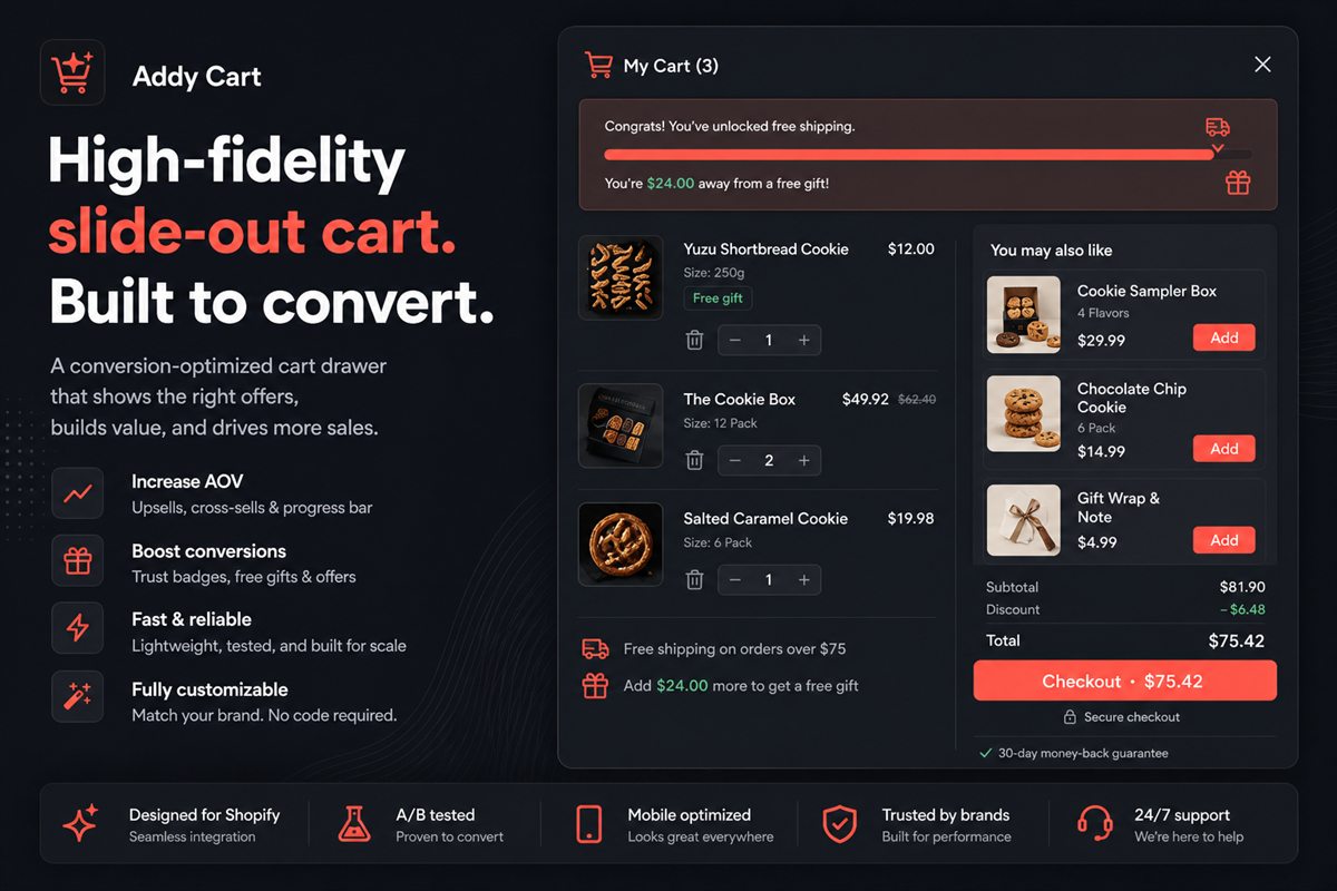
Key takeaways
- A slide cart drawer beats a cart page because it keeps the shopper on the product they were looking at, removing a full navigation step from the funnel.
- Block order matters more than block count. Progress bar, line items, upsell, delivery estimate, trust, checkout — in that order.
- Two upsell offers is the ceiling. A third reliably reduces the take rate of the first two.
- Load the drawer asynchronously and render it only on open, so it never touches your Largest Contentful Paint.
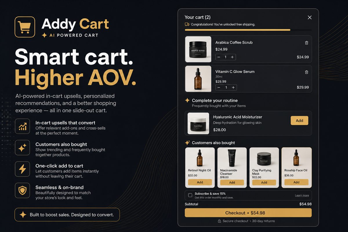
Most Shopify themes ship with a cart drawer that does exactly one thing: it lists what the shopper added. It is a receipt with a checkout button attached.
That is a strange design decision when you consider who is looking at it. Someone who has opened their cart has already decided to buy. They are past every objection that costs you conversions on the product page. They are, in that moment, the most valuable visitor on your site — and you are showing them a list.
This guide covers what to put in that space instead, in what order, and where the limits are.
Why a drawer beats a cart page
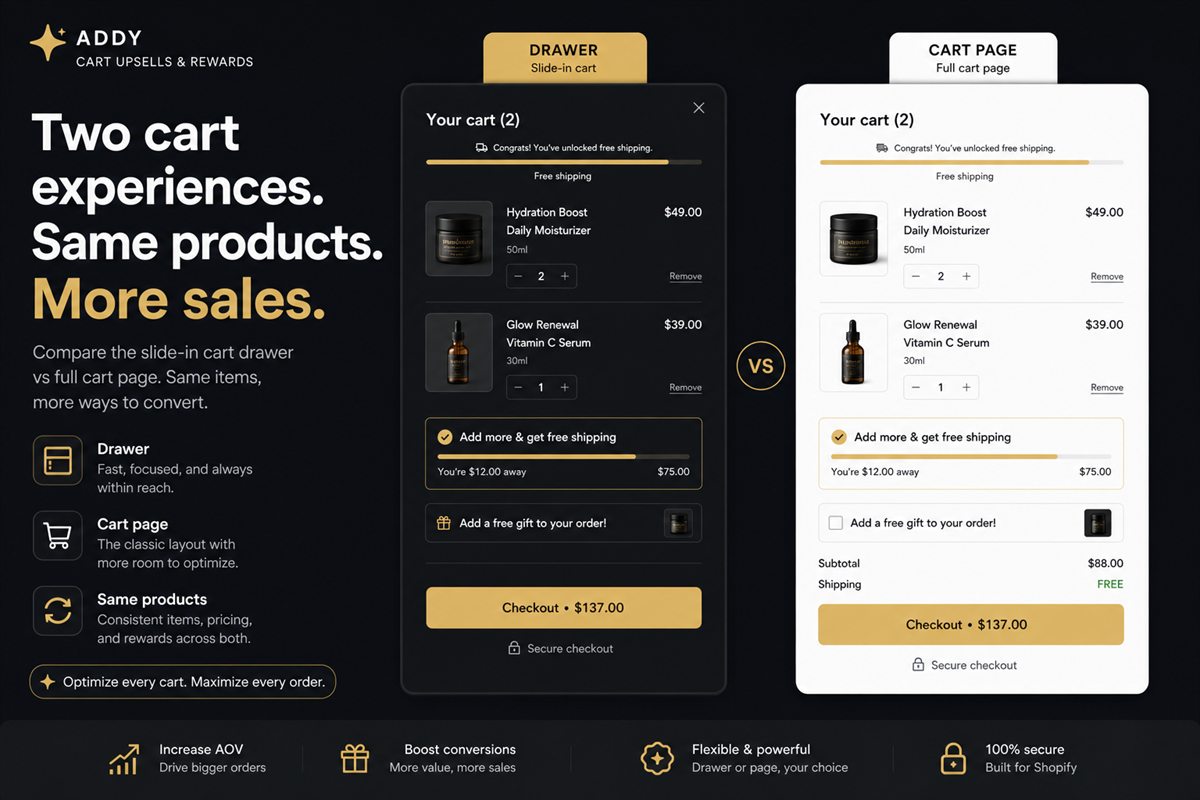
The argument for a slide-out drawer over a dedicated /cart page comes down to a single word: continuity.
When a shopper clicks "add to cart" on a product page and the site navigates them to a cart page, three things happen. They lose the product they were looking at. They lose their scroll position in the collection. And they land on a page whose only forward action is "checkout" — which means the natural next move is to leave your catalogue entirely.
A drawer keeps all of that context. The product page is still behind the overlay. Closing the drawer returns them exactly where they were. Adding a second item costs one click instead of a full navigation cycle.
The exception worth naming: if your carts routinely run to fifteen line items, or your products need per-item configuration, or you sell B2B quantities, a full cart page has room a drawer does not. Everyone else should be using a drawer.
The six blocks that matter, in order
The order is not cosmetic. Each block sets up the one below it.
1. The progress bar, at the very top
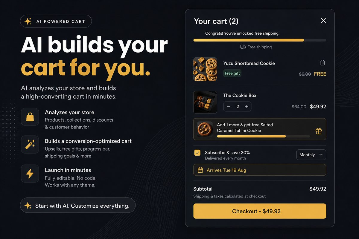
The first thing a shopper should see is not what they have — it is what they are close to getting. A progress bar showing "$18 away from free shipping" reframes the entire drawer from a summary into a task.
Put it above the line items. Below them it reads as a footnote; above them it reads as an instruction.
2. Line items with variant clarity
Image, title, variant, quantity stepper, price, remove. The failure mode here is ambiguity about which variant is in the cart. "Blue / Large" needs to be visible without hovering, because a shopper who is unsure will open a new tab to check, and that tab is where sessions go to die.
Quantity should be a stepper, not a text input. Steppers get used; text inputs get ignored.
3. One upsell block
Not a carousel of twelve. One block, showing one or two products, chosen from what is already in the cart.
The single biggest determinant of whether this converts is relevance, and the only reliable source of relevance is your own order history. Category-based suggestions produce the classic failure — recommending a second pair of the same shoes to someone who just added shoes.
4. The delivery estimate
"Arrives 22–24 August" removes the largest remaining unknown before checkout. It costs you nothing, it is trivially true if your fulfilment is predictable, and it consistently reduces the number of shoppers who close the drawer to go and look for your shipping policy page.
5. Trust and reassurance
Returns window, secure payment, support availability. Small, quiet, below the fold of the drawer. This block exists to answer objections, not to shout.
6. Checkout, sticky
The checkout button should be pinned to the bottom of the drawer and visible regardless of scroll position. Show the subtotal on or immediately above it. If you accept express checkout methods, they belong here too — but below the main button, not above it, because express buttons that dominate the drawer cannibalise the shoppers who would have added one more item.
Upsells that work in a cart drawer
Not every offer type belongs here. The cart is a confirmation surface, and offers that ask the shopper to reconsider their choice will kill momentum.
| Offer type | Works in cart? | Why |
|---|---|---|
| Complementary accessory | Yes | Additive, cheap relative to the anchor, no reconsideration required |
| Quantity break on an item already in cart | Yes | Pure upgrade, zero new decisions |
| Free gift threshold | Yes | Reward framing, no cost to the shopper |
| Shipping protection add-on | Yes, if unticked | Genuinely useful, near-zero COGS |
| Alternative to a cart item | No | Forces reconsideration of a decision already made |
| Unrelated bestseller | No | Reads as noise, dilutes the relevant offer |
| Email capture | No | Wrong moment entirely; you are about to get their email at checkout |
The price relationship matters. An accessory priced at 15–40% of the anchor product converts well. At 80% of the anchor it reads as a second purchase decision, and the shopper defers it.
Personalising by market and segment
A single cart drawer for every shopper is a compromise you no longer have to make.
The obvious axis is geography. A free shipping threshold of $75 is aggressive in one market and trivially easy in another. A delivery estimate of "2–3 days" is a lie outside your domestic zone. Both should change with Shopify Markets.
The less obvious axis is customer segment. A first-time visitor and a customer with four previous orders should not see the same cart:
- First-timers benefit from trust blocks, returns policy and a lower-friction first goal.
- Repeat customers already trust you. Give that space to a higher reward tier or a replenishment suggestion instead.
- Wholesale or tagged accounts should not see consumer discount mechanics at all.
The most granular version of this is block-level targeting — the drawer stays the same but individual blocks appear or hide based on conditions. That is usually more maintainable than building five separate carts.
Performance rules
A cart drawer that costs you 300ms of Largest Contentful Paint has to earn that back before it breaks even, and it usually does not.
Three rules keep it honest:
- Render on open, not on load. The drawer markup does not need to exist until the shopper asks for it. Nothing in a closed drawer should be in the critical rendering path.
- Install as a theme app extension. No
theme.liquidinjection. This is also what makes uninstalling clean — no orphaned script tags left behind in six months. - Measure before and after. Run PageSpeed Insights on a product page before install and after. If LCP moved by more than a rounding error, something is loading that should not be.
A realistic setup order
If you are building this from scratch, do it in this sequence and measure between each step:
- Drawer with clean line items and a sticky checkout button. Baseline.
- Add the free shipping progress bar with a threshold set from your actual order distribution.
- Add the delivery estimate.
- Add one upsell block with pairs drawn from real order history.
- Add trust blocks and reassurance copy.
- Only then: market targeting, segment rules and a second reward tier.
Steps two and four are where most of the money is. Steps one and three are where most of the conversion-rate protection is.
What to measure
Cart-level metrics are more useful than store-level ones here, because they isolate the surface you changed:
- Cart-to-checkout rate — did the drawer make it easier or harder to proceed?
- Units per order — did the upsell block actually add items?
- Average order value — the headline, but not on its own.
- Gross profit per session — the honest number, after discounts and shipping cost.
- Upsell take rate — offers accepted ÷ offers shown, per block.
If cart-to-checkout drops while AOV rises, you have added friction and traded conversions for basket size. Sometimes that trade is profitable. Check, do not assume.
Frequently asked questions
Is a cart drawer better than a cart page?
For almost all stores, yes. A drawer keeps the shopper on the page they were already engaged with, so adding one more item does not require a round trip. The exception is high-consideration carts with many line items, configuration options or B2B quantities, where a full page has room the drawer does not.
Will a cart drawer app slow my store down?
It should not. A well-built drawer loads asynchronously, renders only when opened, and never blocks the initial paint. Check that any app you install ships as a theme app extension rather than injecting a script into theme.liquid, and confirm your Largest Contentful Paint is unchanged before and after install.
How many upsells should a cart drawer show?
One or two. Every additional offer dilutes attention and lowers the take rate of the others. If you have more than two things worth suggesting, that is a signal your recommendation logic needs to be better, not that you need more slots.
Should the cart drawer open automatically after add to cart?
Yes, in most cases. Auto-opening confirms the action, removes any doubt that the item was added, and puts your progress bar and upsells in front of a shopper at their highest point of intent. The exception is stores where shoppers routinely add many items in a row from a collection page.
Do I need to edit my theme to add a cart drawer?
Not with a modern app. Theme app extensions install as blocks in the theme editor with no code changes, which means the drawer can be enabled and disabled from the admin and uninstalls cleanly with nothing left behind in your Liquid files.