 Addy
Addy  Addly
Addly  Goalify
  Monet
Monet  Reviso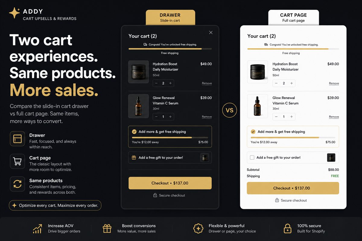
Key takeaways
- A drawer wins on continuity. The shopper never leaves the product or collection they were already engaged with.
- A full cart page wins when line items are many, configurable or B2B — a drawer runs out of vertical room.
- The highest-converting pattern for most stores is a drawer by default, with a "View full cart" escape hatch for the messy 5% of sessions.
- Auto-open after add-to-cart is what makes the drawer pay. A drawer that only opens on the cart icon is just a prettier cart page.
- Keep /cart as a fallback. Hide it from the primary path, not from the internet.
A Shopify cart drawer usually converts more than a dedicated cart page because the shopper never leaves the product they were already looking at. A full /cart page wins when the basket is large, configurable or B2B and a drawer runs out of room. For most stores the pattern that ships is a drawer by default, with a quiet link to the full cart for the messy sessions.
The cart is not a page type. It is a moment. Someone has decided to buy and has not yet paid. Everything you put in that moment either moves them toward checkout or gives them a reason to leave.
What is a cart drawer versus a cart page
A cart page is Shopify's /cart URL: a full navigation, line items, and a checkout button. The product disappears. Scroll position is lost.
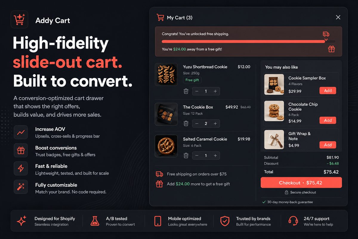
A cart drawer is a slide-out panel on top of the current page. Closing it returns the shopper to the exact pixel they left. Adding a second item is one click, not a round trip.
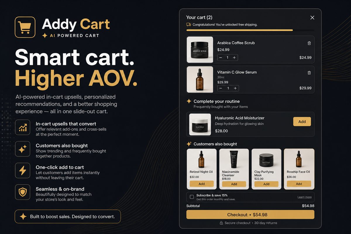
That is the whole thesis. Continuity is the conversion feature. Upsells, progress bars and delivery estimates are what you do with the continuity once you have it. The complete cart drawer guide covers those extras. This post is the choice between surfaces.
What a cart page actually costs
A cart page is a full navigation. The product disappears. The only prominent forward action is checkout, which means the natural next move after "I might want one more thing" is to leave your catalogue entirely and start again from the collection.
That cost is invisible in most analytics, because it does not show up as a bounce from /cart. It shows up as a shopper who added one item, opened the cart, closed it, and never added the second.
On mobile the cost is larger. A full cart page costs a whole viewport of context. The collection, the product image, the size they just picked — all gone. A drawer keeps that context in the background.
Why the drawer wins for most stores
A drawer keeps the product page behind it. Closing it returns the shopper to the exact pixel they left. That is why auto-open after add-to-cart is what makes the drawer pay. A drawer that only opens on the cart icon is just a prettier cart page.
Checkout from the drawer should go straight to Shopify checkout, the same destination as the cart page. You should not add a click. The win is fewer people abandoning before they get there.
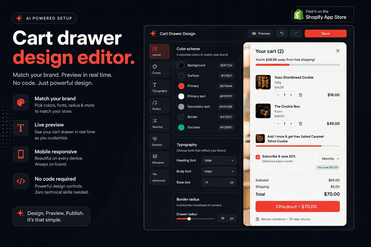
Brand still matters. If the drawer looks like a third-party widget, continuity breaks even though the product is technically behind it. Match the theme before you argue about page versus drawer.
When a cart page is still the right tool
Use a full page, or at least offer one, when any of these are true:
- Carts routinely run to eight or more line items.
- Products need per-item configuration (engravings, subscriptions, custom options).
- You sell B2B quantities where a drawer cannot show unit prices, breaks and notes without becoming a spreadsheet.
- Your shoppers compare several variants in the cart before committing — common in furniture, bikes and technical apparel.
In those cases a drawer feels cramped, and cramped carts get abandoned.
| Situation | Default surface | Why |
|---|---|---|
| One to four simple line items | Drawer | Continuity; room for one offer and a progress bar |
| Many line items or notes | Cart page | Vertical room; line-item controls stay usable |
| Engraving, subscriptions, custom options | Cart page or hybrid | Per-item configuration does not fit a slim panel |
| B2B unit prices and breaks | Cart page | A drawer becomes a spreadsheet |
| Mobile, low line-item count | Drawer | A full page costs the whole viewport |
The hybrid that actually ships
Keep the drawer as the default after add-to-cart. Pin a quiet "View full cart" link under the line items for the sessions that need it. Do not make the full cart the primary path.
Do not hide /cart. Keep it as a fallback for shoppers who bookmark it, for themes and apps that still link there, and for large baskets. Route add-to-cart through the drawer; leave the page in place.
If your theme already has a cart drawer, replace it rather than stacking. Two drawers fighting for the same add-to-cart event is a common source of double-open bugs and duplicate upsells.
How to set this up on Shopify
- In the theme editor, disable or replace the theme's native cart drawer if you are installing another one. One drawer only.
- Set the app to auto-open on add-to-cart on product and collection pages.
- Point the drawer checkout button at Shopify checkout, not at
/cart. - Add a text link to
/cartunder the line items. - Test at 390px width with three line items, an upsell and a progress bar before you ship.
Walk the cart abandonment checklist after the surface is chosen. A fast, native-looking drawer that auto-opens still loses if shipping is a surprise or the offer is empty.
What to measure
Do not A/B test "drawer vs page" on the homepage. Test it on add-to-cart. The numbers that move are items per order, add-to-cart-to-checkout rate, and time from first add to checkout start. If those three do not improve, the drawer is not doing its job — usually because it is slow, it is empty of offers, or it does not open by itself.
Frequently asked questions
Should I hide the cart page entirely if I use a drawer?
No. Keep /cart as a fallback for shoppers who bookmark it, for themes and apps that still link there, and for the minority of sessions with large or complex baskets. Route add-to-cart through the drawer; leave the page in place.
Does a cart drawer work on mobile?
It should. Mobile is where the continuity argument is strongest, because a full cart page costs a whole viewport of context. Test the drawer at 390px width with three line items, an upsell and a progress bar before you ship.
Will a drawer reduce checkout clicks?
It should not add any. Checkout from the drawer should go straight to Shopify checkout, the same destination as the cart page. The win is fewer people abandoning before they get there.
What if my theme already has a cart drawer?
Replace it rather than stacking. Two drawers fighting for the same add-to-cart event is a common source of double-open bugs and duplicate upsells.
When is a dedicated cart page still better?
When carts routinely run to many line items, when products need per-item configuration, or when you sell B2B quantities that need unit prices and notes. In those cases a drawer feels cramped, and cramped carts get abandoned.
Should the drawer open automatically after add-to-cart?
Yes, for most stores. Auto-open is what captures the continuity. A drawer that only appears when someone clicks the bag icon is a cart page with extra animation — you have paid the engineering cost and captured none of the moment.