 Addy
Addy  Addly
Addly  Goalify
  Monet
Monet  Reviso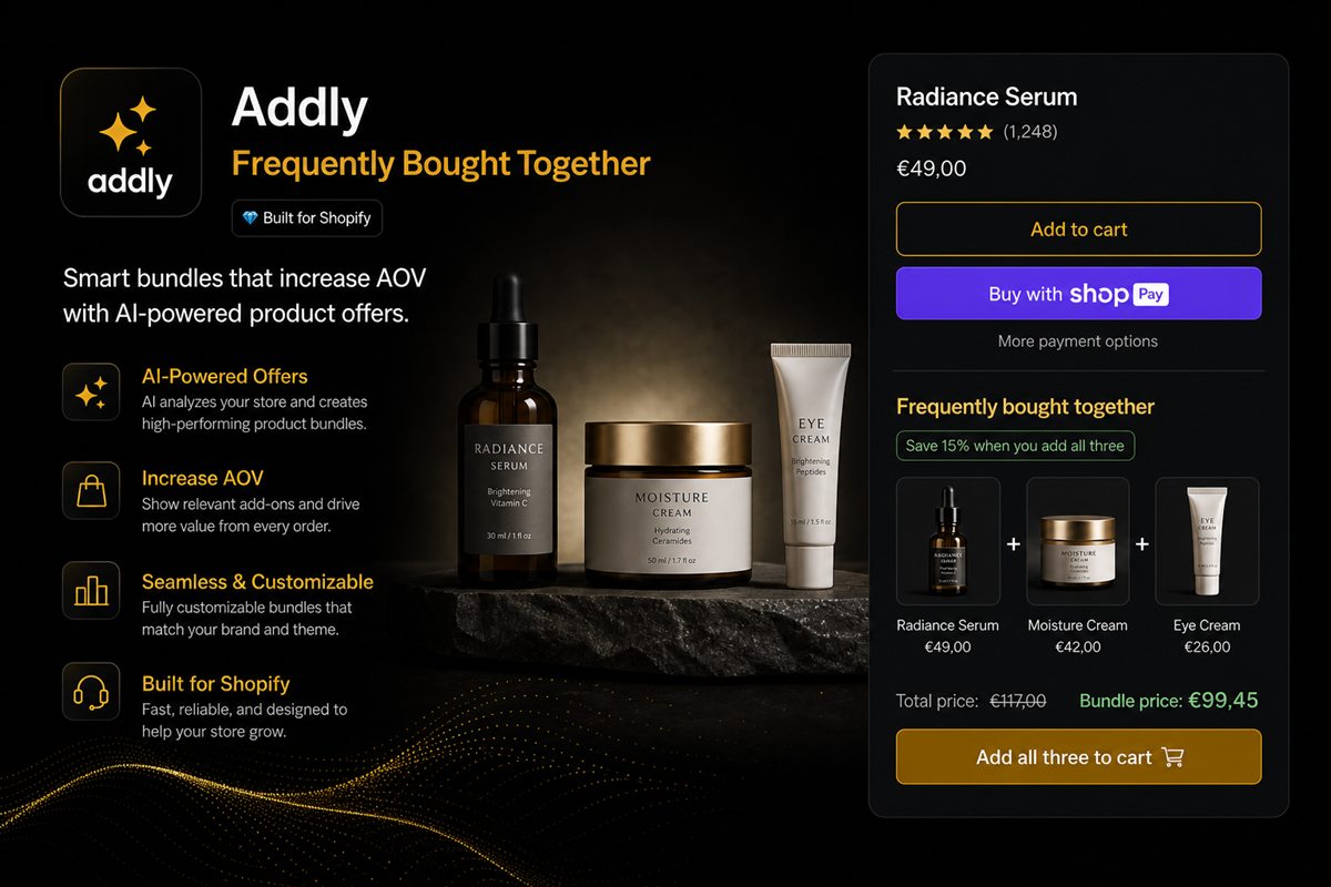
Key takeaways
- If the bundle is the product, it belongs in the buy box — a selector, not a widget under the description.
- If the bundle is an optional upgrade to a single SKU, it belongs immediately under add-to-cart, still above the fold on desktop.
- Footer carousels and "you may also like" rows are for discovery, not for this purchase. They convert like related products, because they are related products.
- Never show the same bundle in two places on one page. The second sighting feels like an ad.
- On mobile, put the offer in the buy box or the first block under it. A tab next to Reviews is a hide.
Place a Shopify bundle where the shopper is already deciding to buy: in the buy box if the kit is the product, or immediately under add-to-cart if it is an upgrade. A bundle the shopper does not see is a bundle you did not offer. Footer carousels convert like related products, because they are related products.
Most product pages bury the offer after the description, the size guide and two app blocks. That row is discovery. This purchase needs a slot in the first screen.
Why placement is the offer
The kit does not fail because the discount is wrong. It fails because the shopper added the single SKU before they ever reached the widget. Placement is not decoration.
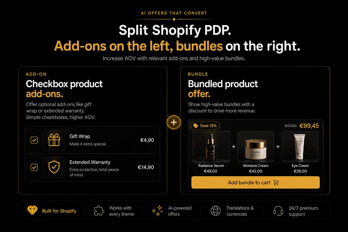
Decide the job first using add-ons versus bundles. Then pick the slot that matches that job. Do not install a block "somewhere in the product template" and hope.
Three jobs, three places
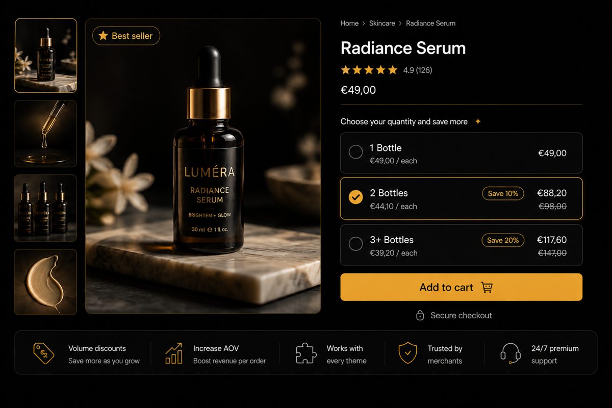
The bundle is the product. The shopper landed here to buy a set. The buy box is a bundle selector: choose the kit, choose the size, add to cart. A single-item option can exist as a secondary link, not as the default.
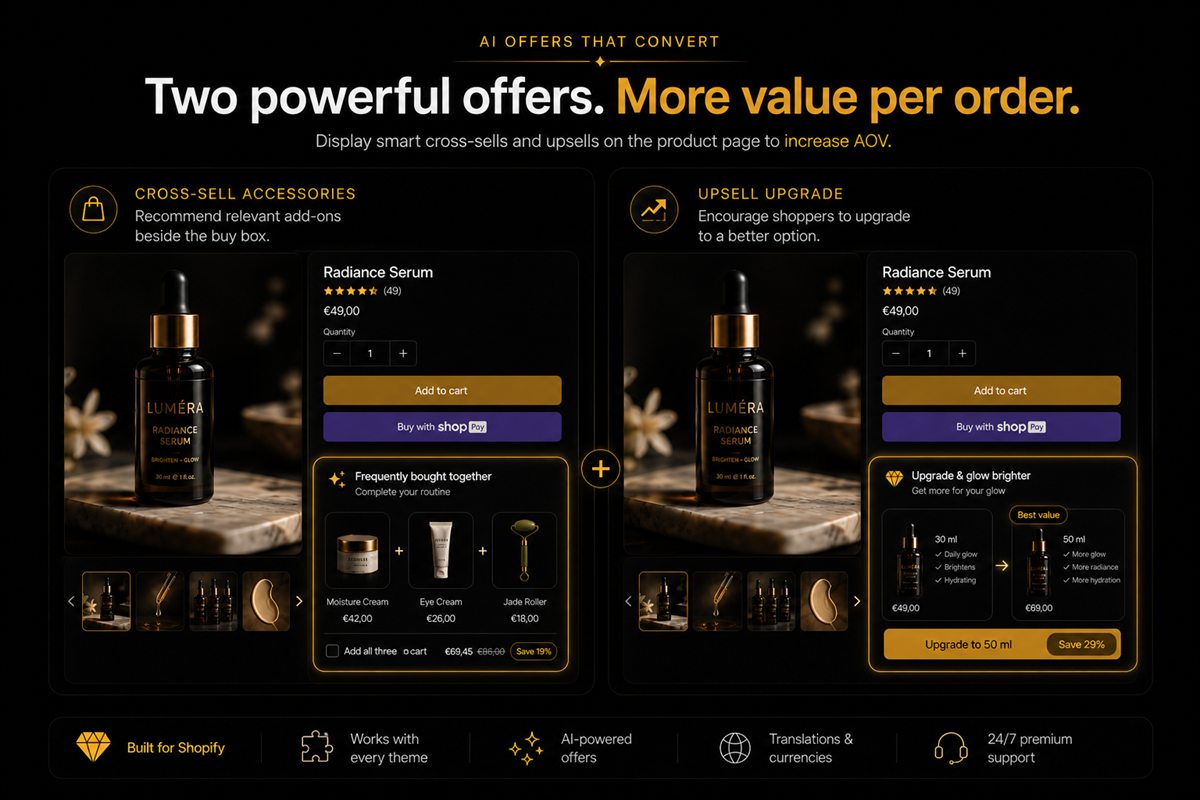
The bundle is an upgrade. The shopper landed on a single SKU. Under the add-to-cart button, one block: "Make it a set — save 12%." Still on the first screen on desktop. Still before reviews on mobile. Keep "Buy this item" as the default unless the set is genuinely the product.
The bundle is discovery. Someone might want a different kit entirely. That belongs in a collection or a "complete the look" after the decision is made — never as the only offer.
| Job | Slot | Default action |
|---|---|---|
| Kit is the product | Buy box selector | Add the set |
| Kit is an upgrade | First block under ATC | Add the single item; set is second |
| Different kit entirely | Collection / after decision | Browse |
The product bundles guide is the structure. This table is the pixel.
What above the fold actually means
On a 1440px desktop, the buy box and the first stretch under it. On a phone, whatever is visible before the first scroll. If your bundle widget is in a tab labelled "Bundles" next to "Reviews" and "Shipping", you have hidden it.
Apps that inject a block "somewhere in the product template" often land in the somewhere. Open Online Store → Themes → Customize, open a product template, and drag the block to the buy box or the first section under it.
On mobile, one screen is all you get before add-to-cart. A cross-sell versus upsell row at the footer will not be seen in time.
How to place the block in the theme editor
- Open the product template you actually use for this SKU (you may have more than one).
- Find the bundle app block or section.
- Move it into the buy box if the kit is the product, or directly under the buy buttons if it is an upgrade.
- Delete duplicate instances of the same kit lower on the page.
- Preview desktop and a 390px phone. Confirm the offer is visible without opening Reviews.
If the kit needs ads, search and collections, give it its own product URL as well. The component PDP can still offer the kit as an upgrade. The kit still needs a URL if you want to advertise it.
Do not double-place
Showing the same kit in the buy box and again in a carousel under the description does not increase take rate. It increases banner blindness. Pick the slot that matches the job. Delete the other.
Never show the same bundle in two places on one page. The second sighting feels like an ad.
After they add
The cart can offer a different completion — a complementary SKU, a quantity break, a free-shipping nudge. It should not repeat the kit they just declined or just accepted. Repeating it is how offers start to feel like pop-ups that never close.
Do not rely on the cart as the first chance. Most shoppers who wanted the kit would have taken it on the product page if they had seen it.
Worked example: serum PDP. "Make it a routine" sits under add-to-cart with cleanser and moisturiser. The shopper adds serum only. The cart offers a travel size or a threshold gift, not the same routine they just skipped.
How to measure placement
Compare take rate of the kit on the parent SKU before and after you move the block, plus parent add-to-cart rate. If the kit rises and the parent collapses, the selector replaced the simple buy. Put "Buy this item" back as the default. If nothing moves, the block is still below the fold on mobile — check the phone, not the theme editor's desktop iframe.
Frequently asked questions
Should a bundle have its own product page?
If it is a kit you want to advertise, yes. The product page of a component can still offer the kit as an upgrade, but the kit needs a URL if you want it in ads, search and collections.
Does a bundle selector hurt single-item conversion?
It can, if it replaces the simple add-to-cart. Keep "Buy this item" as the default and "Make it a set" as the second action, not the other way around — unless the set is genuinely the product.
What about mobile?
On mobile, "above the fold" is one screen. Put the offer in the buy box or the first block under it. Anything that requires a scroll past reviews will not be seen before add-to-cart.
Can I put bundles in the cart instead?
Yes, as a second chance. Do not rely on the cart as the first chance. Most shoppers who wanted the kit would have taken it on the product page if they had seen it.
Where is "above the fold" on a Shopify product page?
On a typical desktop, the buy box and the first stretch under it. On a phone, whatever is visible before the first scroll. A tab labelled Bundles next to Reviews and Shipping is not above the fold.
Should I show the same kit in the buy box and in a related-products row?
No. The second sighting feels like an ad and trains banner blindness. Pick the slot that matches the job and delete the other.