 Addy
Addy  Addly
Addly  Goalify
  Monet
Monet  Reviso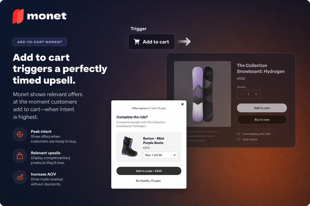
Key takeaways
- The add-to-cart click is a commitment signal. Offers shown after it do not risk the primary conversion because the primary conversion already happened.
- Confirm before you sell. A popup that does not first acknowledge the item was added creates doubt at the exact moment you wanted certainty.
- One offer, priced at fifteen to forty percent of the anchor item, with a one-click accept and an obvious decline.
- Take rate is the fast signal for relevance. Attach revenue is the slow signal for whether the slot is worth using at all.
There is one moment in an ecommerce session where the shopper has unambiguously committed and has not yet moved on to the next thing. It lasts about a second and a half, and it starts the instant they click "add to cart".
Most stores fill it with a small toast notification in the corner of the screen.
Why this moment is different
Every upsell placement is a trade between attention and risk. The product page has attention but any offer there competes with the buy button. The checkout has commitment but you cannot touch it. The confirmation page has zero risk but the shopper is mentally finished.
The add-to-cart moment has an unusual combination:
- Commitment has already happened. The add is done. You cannot lose it.
- Attention is at its peak. The shopper just performed a deliberate action and is watching for the result.
- The purchase frame is active. They are in buying mode, not browsing mode, and the difference in receptiveness is large.
- No friction has been added yet. They have not entered an address or a card number, so an additional item costs them nothing procedurally.
That combination does not exist anywhere else in the session.
Confirm first, then offer
The most important design rule, and the one that separates a popup that works from one that damages the funnel.
The shopper clicked a button and is waiting to find out what happened. If the first thing they see is an offer for a different product, their immediate question is "did my item get added?" — and you have replaced certainty with doubt at exactly the wrong instant.
The correct sequence:
- Confirm. Show the item added — image, name, variant, quantity. Unambiguous.
- Then offer. One complementary item, clearly secondary to the confirmation.
- Then two exits. Continue shopping, and go to cart / checkout.
The confirmation is not a formality. It is what buys you the right to the rest of the modal.
Choosing the offer
The same relevance rules that govern any cross-sell apply, with one addition: the offer must require no new evaluation.
The shopper has just finished deciding. Asking them to start a fresh decision — a different category, an unfamiliar product, a considered purchase — breaks the momentum you were trying to use.
What works:
- A direct accessory. Case, filter, refill, mount, strap. Obvious, cheap relative to the anchor, one-word justification.
- A quantity upgrade on the same item. "Add a second and save 10%." Zero new evaluation, and consistently the highest take rate of any offer here.
- The completion item. The third thing in a set where they now have two.
- A consumable that pairs with it. Coffee with a grinder, blades with a razor.
What does not:
- An alternative to what they just added. Reopens a closed decision.
- Anything more than half the anchor price. Becomes a second purchase decision, gets deferred.
- A category they have not shown interest in. The intent signal is about this product.
- Multiple options. Two choices halve the clarity. One offer, take it or leave it.
The price ratio is worth restating because it is the most reliable predictor: 15–40% of the anchor product's price is the zone where an accessory reads as obvious.
Design specifics
- One-click accept. Accepting must add the item and update the cart with no further steps. Any additional step loses a large share of the people who said yes.
- An obvious decline. "No thanks" as visible text, not a grey X in a corner. A hidden dismiss control converts a helpful moment into a hostile one.
- Never block the checkout path. Both exits — continue shopping and go to checkout — must be visible without scrolling, on mobile.
- Show the price and the saving. If there is a discount for taking it now, state both the price and the amount saved.
- Keep it small. This is not a landing page. Confirmation, one product, two buttons.
- Auto-dismiss is optional and risky. A modal that vanishes mid-read is worse than one that waits.
Frequency
Cap it. This is the difference between a tool and an irritation.
Reasonable defaults:
- Once per session. A shopper adding five items should see the offer once, not five times.
- Never twice for the same anchor product.
- Suppress after a decline. Someone who said no has answered the question.
- Suppress in checkout. Once they have started checkout, stop.
The failure mode here is well known to anyone who has shopped online: the store where every single add triggers a modal. Shoppers respond by adding fewer items, which is the exact opposite of the goal.
Popup or cart drawer?
Both surfaces can carry this offer, and they behave differently.
| Add-to-cart popup | Cart drawer upsell | |
|---|---|---|
| Attention | Full, undivided | Shared with totals and checkout |
| Take rate per impression | Higher | Lower |
| Perceived intrusiveness | Higher | Lower |
| Risk to checkout flow | Small but real | Minimal |
| Best for | One high-value offer | Ongoing, ambient suggestion |
Most stores should run one, not both. Running both means the same shopper sees a related-product suggestion twice in ten seconds, which reads as pressure and tends to lower the take rate of each.
If you want to combine them, differentiate the jobs: popup for a quantity upgrade on the item just added, drawer for the threshold progress bar and a complementary accessory. Different offers, different purposes.
Measuring it
Two fast metrics and two slow ones.
Fast — tells you about relevance, within days:
- Take rate — accepts ÷ impressions. If this is near zero, the offer is irrelevant and no amount of design will fix it.
- Dismiss speed. If most people close within a second, they are not reading it.
Slow — tells you whether the slot is worth using, over weeks:
- Attach revenue per impression. The commercial number.
- Cart-to-checkout rate, before and after. The guardrail.
- Adds per session. The subtle one. If shoppers add fewer items overall after you launch the popup, it is discouraging the behaviour you want, and the attach revenue is not compensating for the loss.
That last metric catches the frequency problem before your reviews do.
A starting configuration
- Fires on add to cart, once per session, desktop and mobile.
- Confirmation block first, offer second, two exits third.
- Offer: one complementary item at 15–40% of the anchor price, drawn from real order-history pairings.
- Small discount for accepting immediately, in the 10–15% range.
- Suppressed after a decline, and suppressed entirely in checkout.
Then read the take rate after a week. If it is close to zero, the problem is the pairing, not the popup.
Frequently asked questions
Does an add-to-cart popup hurt conversion rate?
It should not, because it appears after the shopper has already added the item. The risk is not losing the add but losing the checkout, which happens when the popup obscures the path forward, requires a decision to dismiss, or makes the shopper doubt whether their item was actually added.
What is the difference between an add-to-cart popup and a cart drawer upsell?
The popup is a single dedicated moment with one offer and the shopper's full attention. The cart drawer upsell sits alongside line items, totals and a checkout button, competing for attention. The popup converts better per impression, the drawer is less intrusive. Many stores run one or the other rather than both.
What should the offer be?
A complementary item priced well below the product just added, ideally between fifteen and forty percent of its price. It should require no new evaluation - an accessory, a consumable that pairs with it, a quantity upgrade on the same item.
Should the popup appear on every add to cart?
No. Cap it to once per session at most. A popup on every add is the fastest way to make a shopper stop adding items, and it converts a helpful moment into an obstacle.
Is a popup better than expanding the cart drawer?
For a single high-value offer, generally yes, because the popup has no competition for attention. For stores that want the offer to feel like part of the cart rather than an interruption, the drawer is safer. Test both against cart-to-checkout rate, not just against attach rate.